Like so many before me I bought a prime lens and marvelled at the beautiful portrait pictures I could take with it. The background turned soft and almost disappeared behind my subject. It was a great way to isolate the person and focus on their expression. I became good at capturing what I thought was the right moment, usually with people looking into the camera and smiling. The subject was either dead centre, or just slightly to the side looking in toward the centre of the frame. For a long time I was happy with that look, it developed a bit while I learned and became more observant on how the light and shadows interplayed to give the photo more depth.
About a year ago I watched a youtube clip about composition, leading lines and other very basic thoughts on how to guide the viewers attention. It went right over my head, and I pushed against the ideas, feeling inadequate and left the computer with a dissatisfied feeling of having to settle for good enough. After some time I started watching other videos on youtube about composition, the importance of placing your subject so that it was clear against the background.
Somewhere along the way this erratic searching of tips online became a quest to learn more about composition and design. I stumbled upon a page called “The Canon of design“, a blog with a 365 project that posted about how to make better images. The author kept iterating how abberant the rule of third was. It is simple, which in itself is not a bad thing, but if you kept repeating it too many times it becomes boring. He looked at paintings and analysed how the masters of old had put them together, and slowly my eyes opened and I started to appreciate their work. For the first time I looked at a painting in detail.
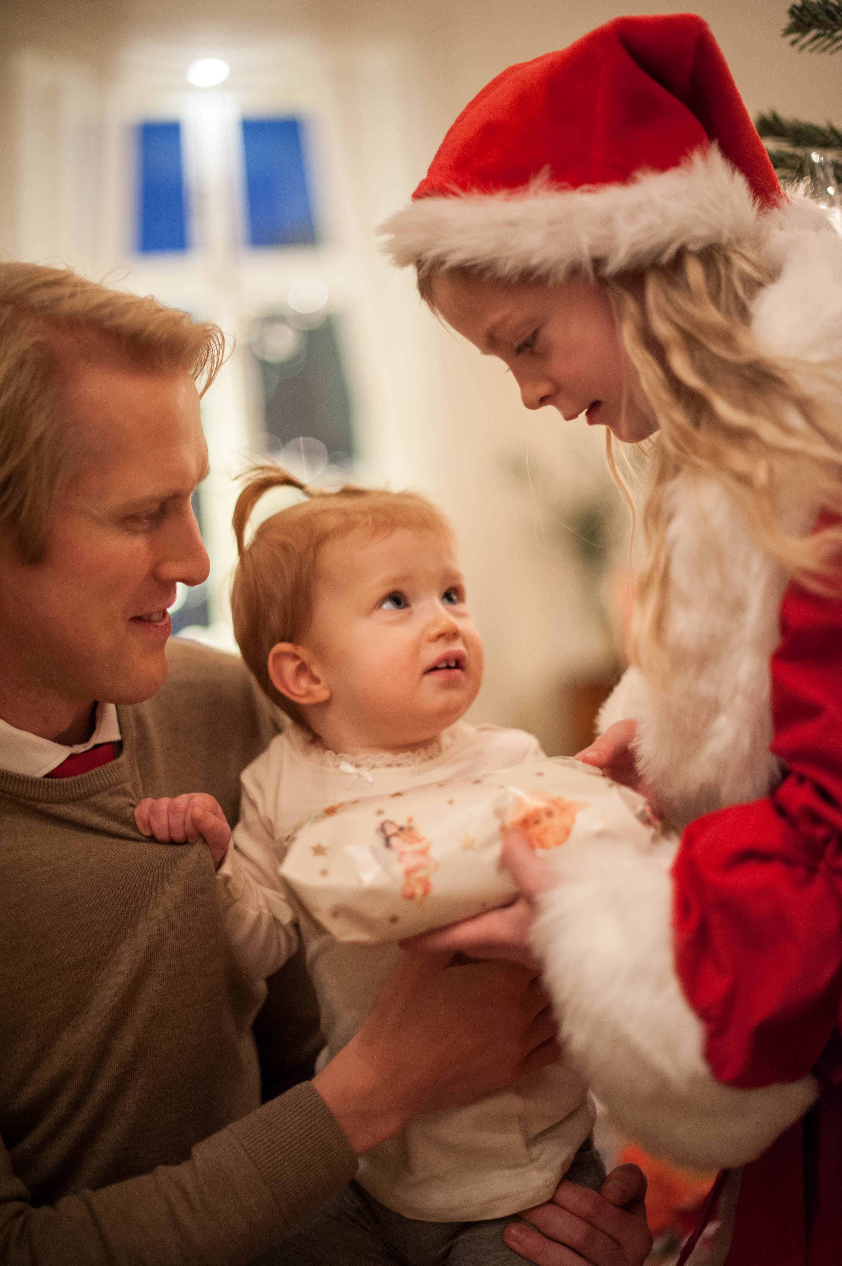
Hopefully this new direction in my photography will result in better images. What I am currently trying to do is move away from wide aperture portraits to photos with slightly more depth of field. I want to capture my subject in a setting, and if possible give my previous flat portraits more a sense of depth. Also I want to learn how to better control the attention of my viewers, how to guide them through my images with lines, repetitions and light. In the image below you follow my niece’s gaze up at Santa’s helper, and then return back to her. After exploring all three subjects it probably wanders off into the background, noting the window and the Christmas tree. Part of the image was planned, I went down to get at their eye level, but other things like Stella’s hand gripping my brother’s sweater for support was a detail that I had no control over, and that added a lot to the feeling of the photo.
-

My niece met Santa for the first time. A year ago this photo would not have made the cut since she looks more worried than happy. I now think it captures the moment, her eyes looking up at Santa’s helper, the little hand holding her father’s sweater. The other two heads framing her beautifully. It is getting late here, so I will have to continue in another post later.
/Johannes
Be First to Comment