Last Saturday Jean-François Mercure and I organised the first post doc photography workshop. Our aim is to build a community with a focus on social activities and creative photography. We started planning it a few weeks ago and decided to begin with an introductory session, since from past experience with Phocus (Cambridge University Photography Society) those events were always well attended. We advertised it in the weekly PdOC newsletter and within a few days had fifty responses. Everyone responding was not able to make it on the Saturday we had proposed but it was clear there was a great interest for it. Such a large crowd would work for the presentation and demonstration bit, but we also wanted a hands on practical session afterwards. After some discussion we decided to split the workshop into two groups with a morning and an afternoon session. In the future we plan on just having one session of each since we want to form one community.
Our presentation covered camera basics, and a bit about light and composition. We expected a mixed audience, but wanted to make sure there was at least something there for everyone. The impact of aperture on depth of field, how to creatively use longer shutter speed and a tripod to get a single person sharp in a crowd where everyone else is moving. We also wanted to make people think about what light they had in the scene, where was it coming from, did it cast a diffuse or a sharp shadow. For example, during the practical session some took photos with their subjects facing the camera, against a bright window in the background. This cast the face in shadows, which could have been ok if it did form an interesting silhouette, but that was not the case here. By instead moving to the side, and perhaps asking the subject to turn or tilt their head, a better play of light and shadow was created on the face, showing depth. There is a good exercise with an egg that has been making rounds around the internet, the idea is that you photograph an egg with the light coming in from different directions. A front-lit egg is very flat, one where you get light from 45 degrees angle has much more depth. We showed some examples of different light, and they got a chance to practise it after the presentation.
The egg video by Joe Edelman. If you are in a hurry, skip forward to 2 minutes into the video to see the egg in action.
For the demonstration we had tether the camera through a usb cable to lightroom, so we could show photos live on the big screen moments after they were taken. One thing about composition that we wanted to illustrate was that it is usually a good idea to leave some breathing space in the direction of the gaze of your subject. So first we took a photo with the subject where she was placed to the right in the frame, while looking to the right. Then the idea was to take a photo with the subject in the left part of the frame, looking towards the centre. The latter should hopefully look better, however when the first photo came up on the big screen it was clearly much better. In the background J-F was about to sit down, stealing the show from the girl in the foreground. I guess this illustrates the importance of paying attention to everything in your frame, since our minds are a bit selective in what we see, but the camera captures everything.
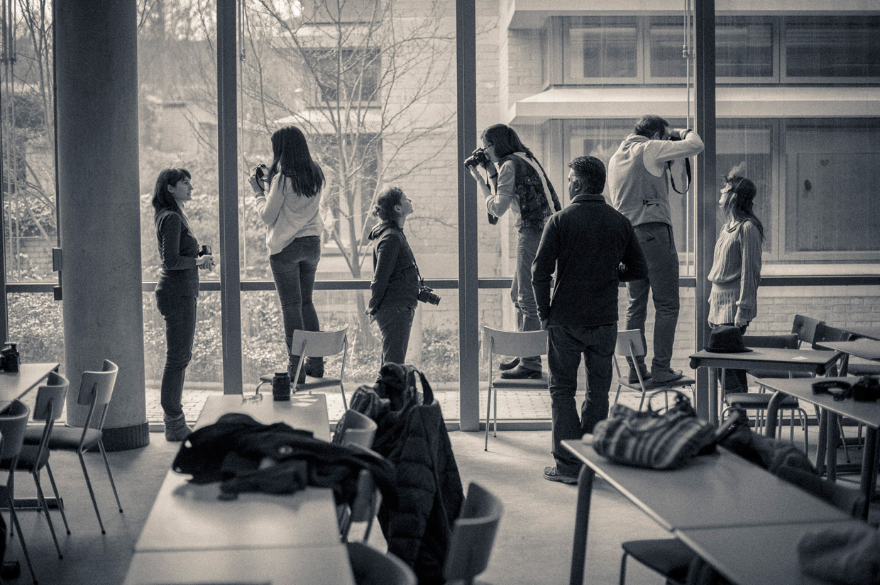
We had prepared posing cards, to get the practical session started. The idea was that by giving the groups a task they would start working as a team, and the person playing the role of the model would not feel so self conscious about being in front of the camera. We had also asked people to bring some props with them, to spice up the photos. If you got time head over to our PdOC Photo Workshop page on facebook and see what we did. There is a brilliant family photo album among other things.
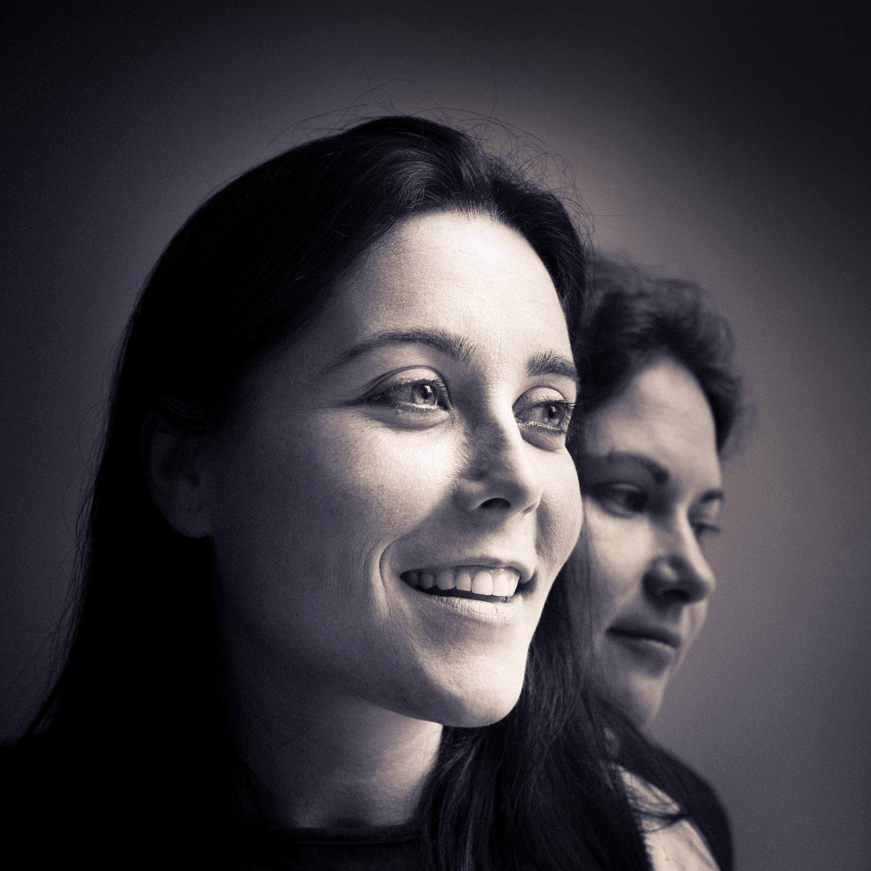
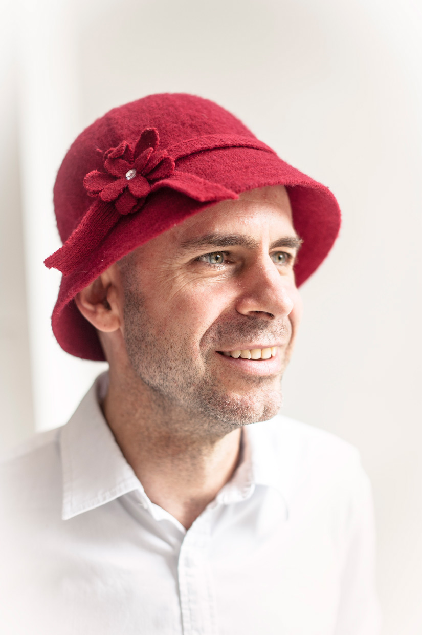
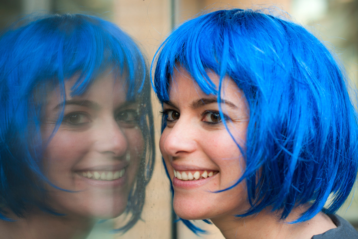
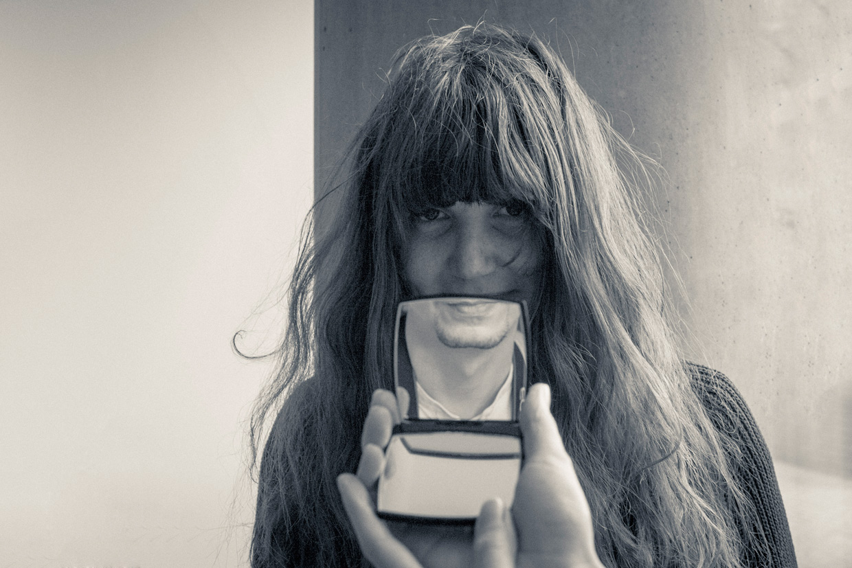
After the morning session we went for lunch, delicious sushi at Teri-Yaki, where people got to know each other a bit better and we talked about ideas for future workshops. Everyone was very enthusiastic and looking forward to our next workshop. The afternoon session was quickly approaching, so we had to hurry back to meet the next crowd. You can see some of the photos from the two sessions below.
Things we hope to do is a photo walk either in Cambridge, or some location which we can reach by train or car, a night shoot with light painting and a photoshop workshop. If you have any special requests, please let us know.
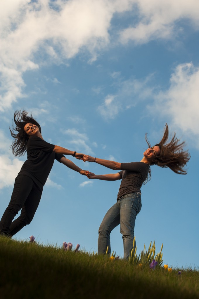
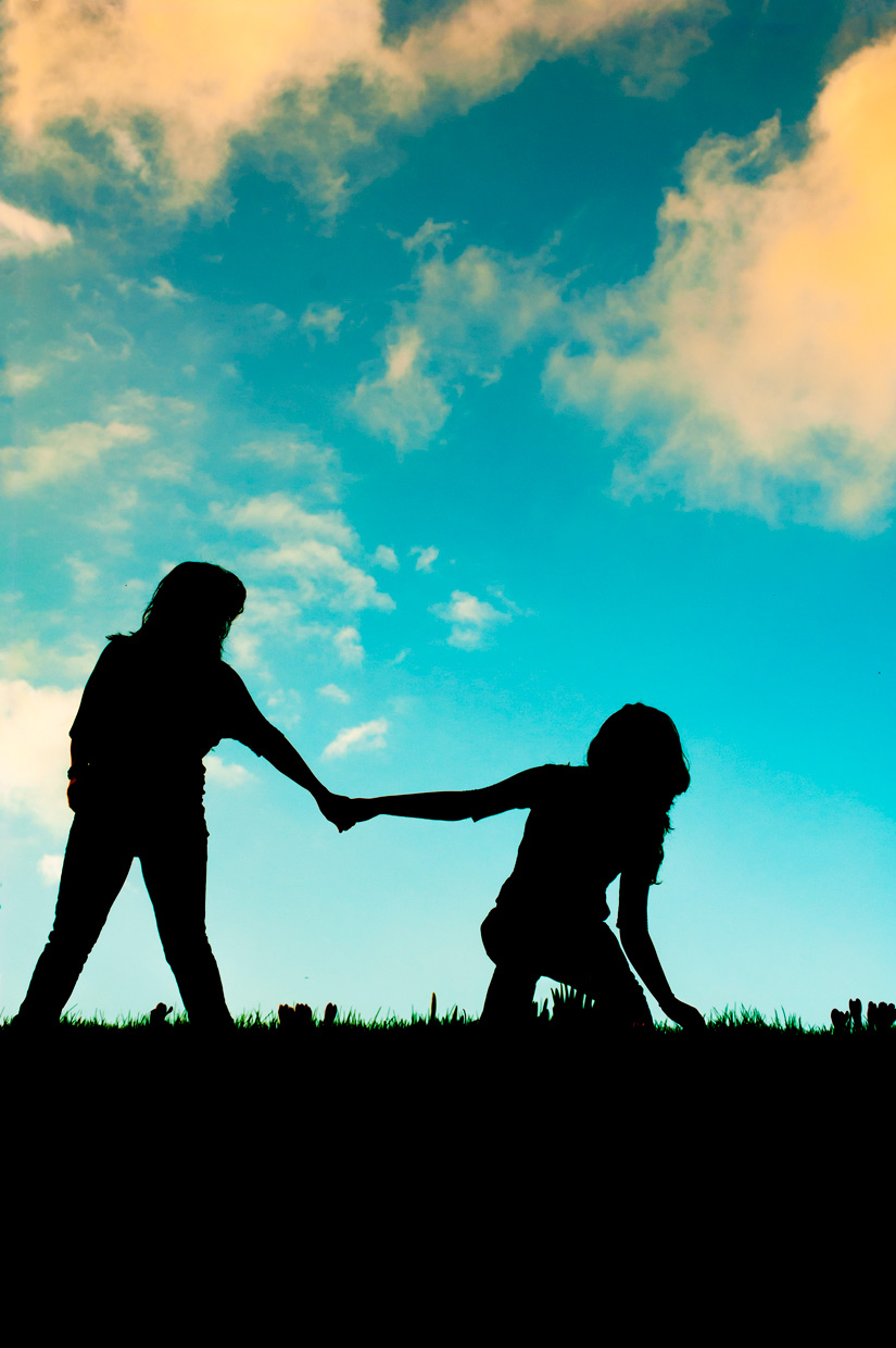
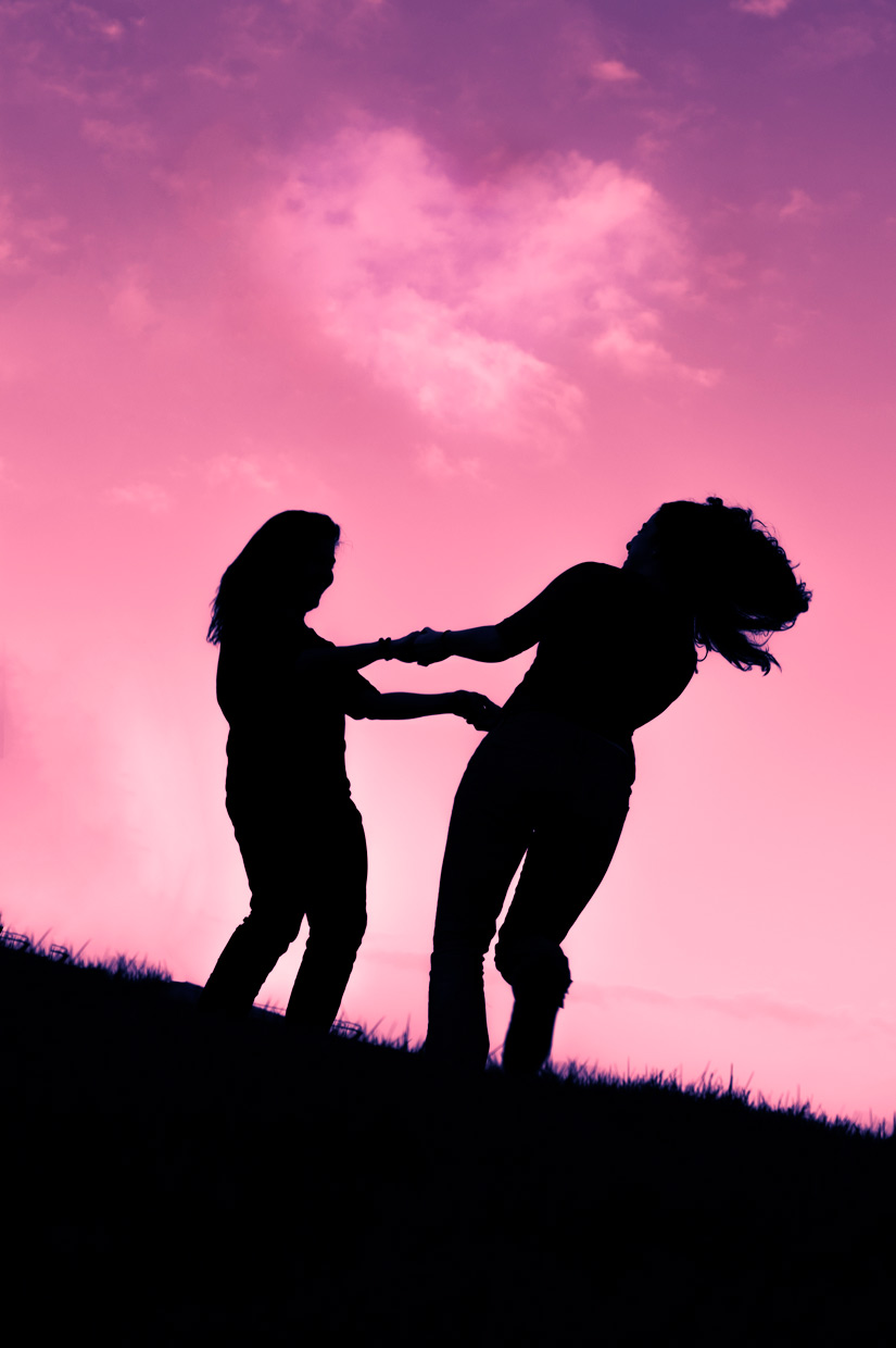
/Johannes
Be First to Comment