When I am out taking photos I usually look for eye catching things that I then try to capture as I see them. Unfortunately when I look at the photo afterwards the picture does not have the same impact on the screen as it did in my mind’s eye. There are many reasons for this, but one of them is that a camera records everything in the frame, while our eyes and brain filter the visual information. When we then later look at a photo, we discover details in the photo which distract from the main object which we might not have seen the first time. We have all done the unwanted lamp-post or tree branch sticking out behind our friend’s head. It is therefore common that we try and simplify our compositions in the camera to make them more similar to how we naturally perceive.
There are a few things we can do to make the object stand out more. Usually our eyes are drawn to the brightest region, or the region with the highest contrast. A person in black clothes might disappear if surrounded by shadows, but if a patch of sunlight illuminates the area around her then she will stand out strongly against the background. If the background is distracting or making the object disappear due to low contrast then I will try and move around or hunker down to try and find a better angle. Getting closer also gives a more intimate feel to the photo. Another way is to work with depth of field, by having a big aperture (small f-number) we will limit the region that is in focus and thus guide our viewer to the region where we want them to look. The eye does not usually linger as long over the blurry parts of the image, so they are less likely to compete for attention.
My New Year’s resolution last year was to take more black-and-white photos. Now in retrospect I realised that I forgot about it after a few months, but it was quite fun and educational while it lasted. One thing I found was that there were a lot of photos where the colour did not really add much. The object and the background might have similar colours, or there might be distracting colour elements that competed with the object for attention.
When converting a photo to black and white you can choose how to mix the different colour channels together. There is the naive choice where you weight each channel equally. There is an auto-option which usually does a pretty good job of enhancing the contrast, however sometimes you might want to take creative control. For example, lets say that you have a person in dark clothes standing on a very dark green field. When you convert this to black and white the person might almost disappear. What you can then do is pull up the weight of the green colour into the black and white mix, this will cause the grass to become brighter, making your object stand out more. This also works for bright skies, by pulling down the luminance for the blue you can recover some of the interesting clouds and create a more dramatic sky. A word of caution though, it is very tempting to pull the lever all the way to get the strongest effect. Whenever that urge occurs take a look at the border regions where for example the sky intersects with a building. If you start to see an unwanted dark or bright edge around the building then you have moved the lever too far, pull it back a bit until this border effect disappears.
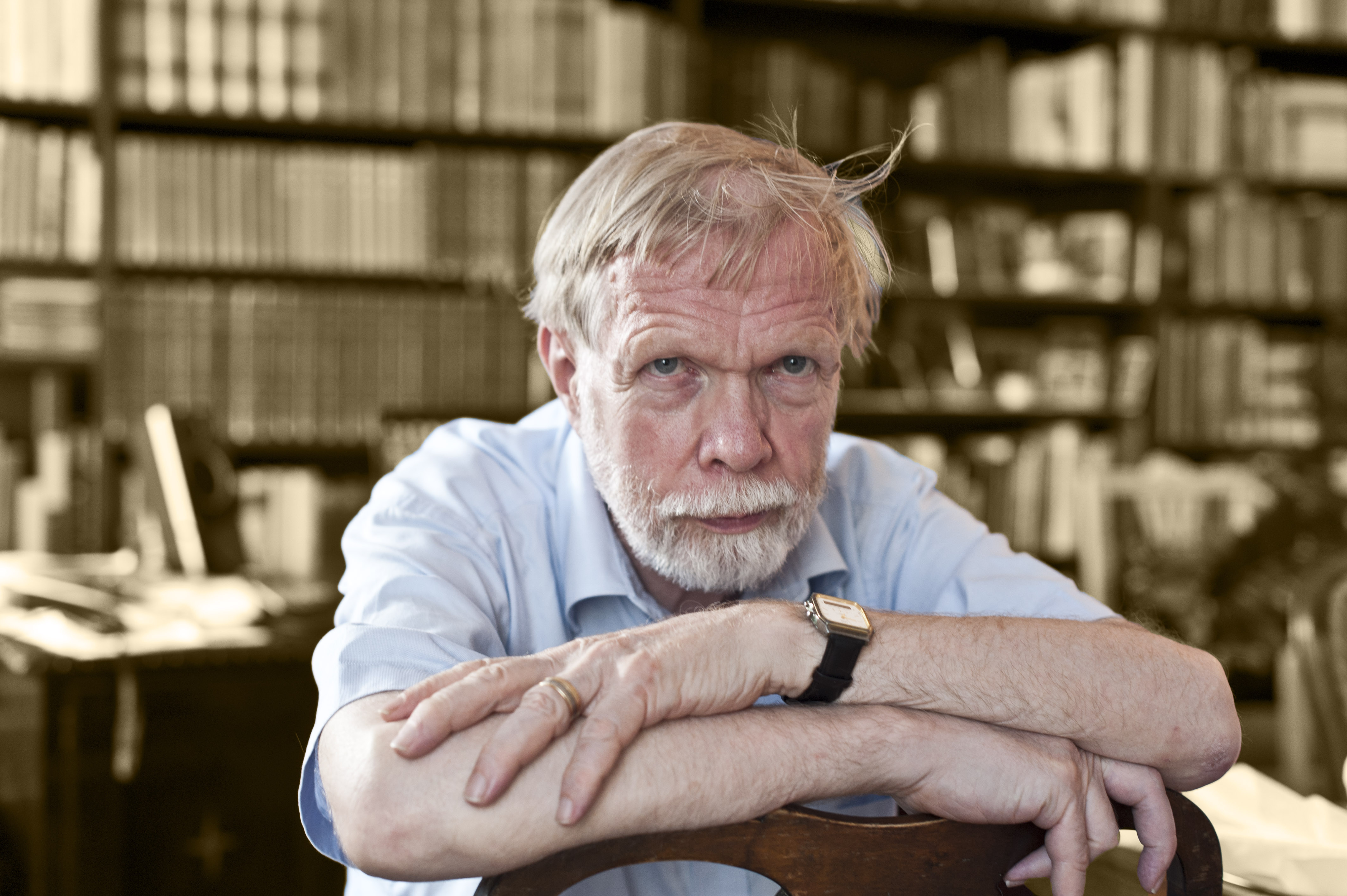
Of course, when converting to back and white, you do not have to desaturate the entire image. Sometimes it might be better to leave part of the image in colour, which then focuses the attention of your viewer on a specific part of the image. The easiest way to do this in photoshop is to add a desaturating layer, and then edit the layer mask for this layer so that it only desaturates the part that you want. I took the photo below of my dad back in August 2012, I liked the picture but the bookshelf behind him was very distracting with books of lots of different colours. What I did here was duplicate the image into two layers, one which was black and white, with a bit of split-toning which gave it a sepian tint, and a second layer above with the original colours that I masked so that it only covered my dad. The resulting image worked out quite nicely with the focus on my dad.
There are other things that can be done in post processing, one of my favourite set of functions are the content-aware ones. You can use them to remove a patch of the image with a distracting element like a bright piece of metal, or you can remove spots or wrinkles that are unflattering should you so wish. Not everything distracting should be removed just because you can. There are some examples where the extra element adds depth to the picture, and helps coax your eye into an otherwise empty part of the image. So after you finish cleaning up the image, compare it to how it was before, and see if you really liked the change or if you just did it as part of your post-processing routine.
/Johannes
Be First to Comment