I used to look through all my digital photos once a year and print the best ones, and put them in a photo album. I took the photos pretty much straight out of the camera without doing any post processing. I enjoyed the physical realisation of my pictures. It was a nice feeling, each photo was like a little diamond that triggered a memory. Going through them brought me back to the different events in my past year. For some reason I have not taken the time to do that since I moved abroad back in 2009. Recently I started thinking that it would be nice to print a few photos again, or maybe make a photo book.
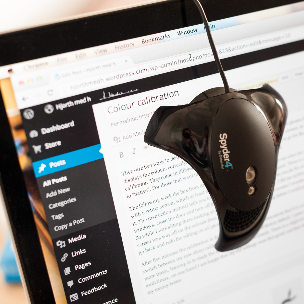
I began shooting in RAW format about two years ago, which meant that I have the option to adjust white balance in post processing. If your monitor does not show the right colours, then the adjustment you do will also compensate for the hue of your monitor. You introduce errors to correct for your hardware errors, and when you print photos that have been adjusted on a monitor with incorrect colours they will look wrong. There are two ways to deal with this. One is to make a test print, and check that the photos look right. The other option is to make sure your monitor displays the colours correctly. I decided it was better to make sure the screen was correct, so I went online on Amazon and ordered a Spyder4 colour calibrator (Amazon link). They come in different versions, and after reading up a little I decided to go for the model which allows you to set the white colour temperature to “native”. Not sure it was really necessary, but I figured I spend enough time on this hobby to warrant making sure I have the right colours.
The following week the box from Amazon arrived, and I was a bit curious to see what the verdict for my display would be. I use a two year old Macbook Pro with a retina display, which at least to a first approximation looks pretty good. There is a bit of ghosting on the screen, but other than that I am happy with it. The resolution is just amazing. The instruction manual for the colour calibrator tells you to avoid direct light on the screen when you do the calibration, so I figured I’d put the computer in a room without any windows, close the door and turn off the lights. You probably guessed it, I did my calibration in the bathroom. You hang the colour calibrator on the screen and press go, then the process takes about five minutes. So while I was sitting there looking at the different colours flash on the screen I wondered what the outcome would be. I was slightly concerned that if the screen was way off on the colours then I might have to redo my editing before I could print photos. The last few years I have been very prolific and having to go back and redo the editing on all photos was not really an option. I was (almost) holding my breath staring at the colours being displayed on the screen and lighting up my bathroom walls, one after the other.
After five minutes the calibration was finished and the computer announces that it is now using the new colour profile. There was a toggle that allowed me to switch between my new shiny calibration settings and the old factory default. I press it and nothing happens, I press it again, no change. I click it a few more times, leaning in towards the monitor to study the example photos more closely. There was a slight hint of difference in the contrast, but it was barely noticeable. It was a bit of an anticlimax, on one hand I am happy that my old settings were that good, and that the monitor was correct, on the other hand I feel like I could have used my money better.
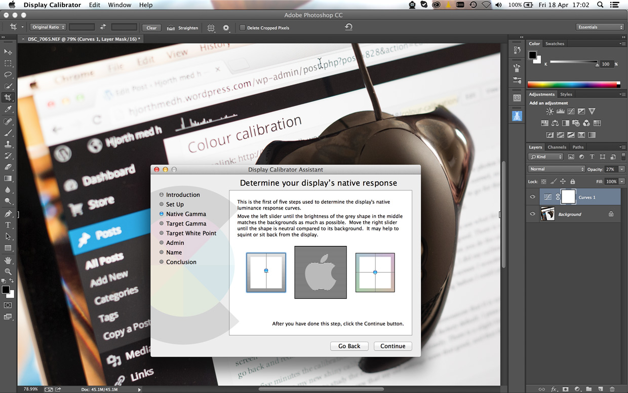
There is a manual option in OS X that you can use to calibrate your colours without having to buy any fancy hardware first. You go to “System Preferences”, chose “Displays” then click on the “Color” button then “Calibrate”. I decided to try it out, Apple gives you a series of five dialogue boxes where you are told to adjust the intensity of the Apple logo until it matches the surroundings. The Apple logo is a solid colour and the background is made out of alternating bright and dark lines, so you have to squint with your eyes and adjust the levers until they match. The left lever with the luminance is easy, the colour balance is a bit trickier. I compared the resulting settings and my manually tuned calibration was a bit darker than what the Spyder provided.
In science you won’t see many negative results being published, it is always the new shiny findings that make the big splashes, but negative findings are also important. Here in my little corner of the internet I can write a blog post about a negative result like this. In theory a colour calibrator can be a godsend, correcting for unwanted hues, but in retrospect it was not really necessary for me since the factory calibration of my screen was already so good. However now I know it is correct, and I have the option to calibrate my future computers as well. I guess I bought myself a little peace of mind.
– Johannes
Hi Johannes,
as you had an issue w. the preview of the uncalibrated / calibrated screen this looks like you did this on a Mac w. 10.9.x on.
There was a display issue w. the 4.5.6 version, the calibration worked.
This was fixed w. the 4.5.8 version you can download from the website:
http://www.datacolor.eu/goto/downloads/Spyder4Pro
Yours
Datacolor Team